I’ve been spending time this summer developing a data visualization course for the iSchool’s new Data Science program. This course is intended to introduce graduate students in the program to concepts and skills related to the visual display of large sets f data. We’ll be covering three broad themes: 1) technical skills and tools, 2) graphic design principles, and 3) social and ethical issues related to visual representations of large data sets.
(If you are curious about data science in general, one of the faculty involved with the Data Science program, Jeff Stanton, just published a great (free!) eBook called “An Introduction to Data Science,†available through iTunes.)
In addition to Adobe Illustrator, it will be necessary for students to work with at least one of the open source programming environments that can handle large data sets and also have particularly powerful visualization capabilities (like R and Processing). We’ll be using R for the class, though Processing came in a close second.
Because it’s been a while since I have done any coding, most of the attention I have given to planning the course over the last several weeks has been devoted to getting reacquainted with the command line. I’m remembering how much a really do enjoy working with code (even if I’ll never be a rock star programmer and my heart has been won over by qualitative discourse analysis). But this post isn’t about programming.
Stating the obvious
When I sat down last week to map out what the class might look like on a week-by-week basis, I realized that I’d once again overlooked the obvious. My students will be predominately grad students with technical backgrounds and almost certainly will have had at least some exposure to coding. However, many will have never taken a visual design course. Ever. Clearly one of the most important objectives of the course is to provide a foundation and rationale for representing data in images and to create opportunities for students to learn the language of visual communication. If they don’t get exposed to these ideas here, they won’t get exposed to them anywhere.
So, as much as I was having fun with the code, I realized I needed to turn just as much attention to the basics of visual representation. I made a list of some basic visual design concepts that I thought might be most helpful in this context: proximity, similarity, contrast, scale. In thinking about it, however, I became highly self-conscious that my students might be insulted or maybe even disappointed by the sheer simplicity of these ideas.
Proximity
Take proximity for example: Near…Far. I could imagine my students saying, “Yeah, Jaime, we get it, it’s not that hard. Actually we got it a few years ago when we saw that Sesame Street episode…(am I really paying for this class????).â€
The challenge of drawing attention to many of the most basic and core visual concepts is that we use these principles so constantly, continually, and intuitively that they are embedded in both physical and cognitive mechanisms for perception. The visual design principle related to proximity goes something like this: Things that are physically close to each other are related. Things that are distant from one another are not related. Beyond the notions of far and near, the power of this idea comes from the grey area between these two statements. No offense, Grover, but you are just tackling the tip of the iceberg.
It can feel a bit like stating the obvious when trying to talk to a student, or any one for that matter, who is technically minded and who may never have been exposed to design thinking or art making (visual, literary, music, any medium…). In fact, it can feel like shouting the obvious. There have been times in my classroom when I feel like Grover, breathlessly repeating the same mantra, hoping for it to click: “Near… far… near… far…near…far… DO YOU SEE WHAT I MEAN? DO YOU REALLY UNDERSTAND? SHOULD I DO IT AGAIN? HERE, LET ME DO IT AGAIN…â€
The urgency that I feel at these times is not about whether my students understand the difference between something that is physically close and something that exists at a distance. I certainly hope they get that, they are college students for goodness sake. What I am really trying to explain is that the intellectual and perceptual play embodied by visual design is theirs for the taking. I am hoping that they can make the connection that, as designers of information, concepts like near and far can be powerful tools of agency. Maybe I need to switch from channeling Grover to being more like Yoda.
Dante to Data Science
For me, effective visual communication involves embracing and exploring the space between opposites, dwelling within the grey area between near and far, heavy and light, black and white. There is a wonderful short book of essays by Italo Calvino called “Six Memos for the Next Millenium.” It is a collection of meditations on six literary themes: lightness, quickness, exactitude, visibility and multiplicity. The first essay explores the contrast between lightness and weight, using passages from Dante’s Inferno to explore the range that lightness can take, for example these two contrasting descriptions: “As snow falls in the mountains without wind†and “Like some heavy thing in deep water.†(p. 15)
When I try to think about ways to present basic visual concepts like proximity, I am overwhelmed.
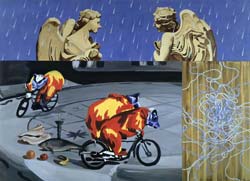
Proximity makes me think of the contemporary postmodernist painting I cut my artistic teeth on: juxtaposition and dissonance were the first words I learned in art school (haven’t thought about David Salle in a long time….). By creating visual non sequiturs, these painting challenge our assumptions about the meaning of proximity in terms of cultural, social and psychological norms. Sometimes things that are in close proximity are not alike, no matter how much we try to make them relate to each other. Images that are close can be antagonistic, held in a delicate tension.

Angels in the rain by David Salle, Downloaded on 20 July 2012 from http://www.saatchi-gallery.co.uk/artists/david_salle.htm/
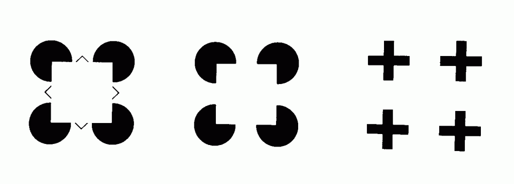
Proximity also makes me think of the physiology of the human eye and our cognitive ability to perceive and disambiguate occluded forms. The image below is from a book by Donald Hoffman, a professor of Cognitive Science at UC Irvine, called “Visual Intelligence.†Among other things, this book highlights the cognitive leaps we make about the relationship between shapes when information is missing or incomplete.

Adapted from “Visual Intelligence: How we create what we see” by Donald D. Hoffman. W.W. Norton & Company, 1998.
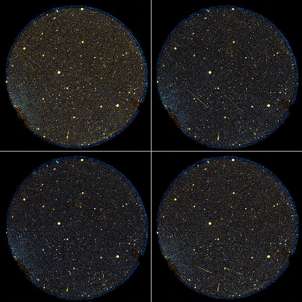
And proximity makes me think of the stars in the sky, how the points of light that I perceive as being near to each other, might actually be light years apart. In fact, depending on how far away they are from where I stand, and the length of time it has taken for the light to get to me here on earth, those two stars that I plainly see as being side by side might not even have ever existed at the same time.

Photo Credit: NASA/JPL-Caltech. The two brightest objects appear to perform a sharp turn then travel in the reverse direction. This illusion is most likely the result of the Galaxy Evolution Explorer overtaking the objects as it orbits around Earth. Downloaded on 20 July 2012 from http://commons.wikimedia.org.
And here we come back to data science. When we represent large sets of data using images, the goal is to reduce the data to only that which is useful, to identify patterns, to find the needle in the haystack. Similar data points might be literally or figuratively very far away from each other. False relationships might appear as a result of coincidentally close proximity.
My task is to talk to my students about things like near and far in ways that will show the power behind the principles so that these future data scientists can go into the rapidly expanding universe of data fully equipped to describe what they see. They will probably not express themselves as poetically as Dante, but I hope to cultivate in these technical students an appreciation and high degree of sensitivity to the grey area between near and far, big and little, identical and unique.
